Chocolate Bar — Tea in a Wrapper
A four-flavor chocolate brand built around the rising tea-drink trend — bubble tea, Thai milk tea, matcha, and Earl Grey — each wrapped in latitude-and-longitude graphics that mark where its tea was born.
Overview
This project is a packaging system for a four-flavor chocolate brand. The chocolates come in bubble tea, Thai milk tea, matcha, and Earl Grey — all designed around tea as the conceptual highlight, with custom illustrations for each variant.
The deliverables include the chocolate-bar packaging system and the accompanying brand logo.
Target
- Consumer age range: 16 – 26
- Target market: European and American
- Sales channel: mid-market supermarkets (e.g., Trader Joe's)
- Price range: USD $6 – $8 per bar
Highlights of Design
Five details that define how the package looks, opens, and tells its story.
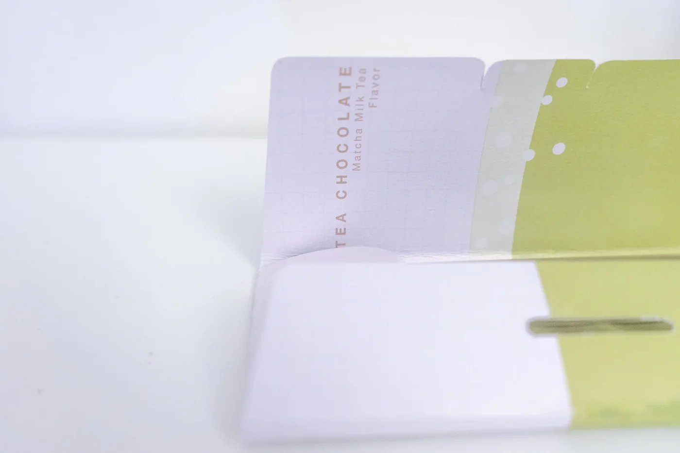
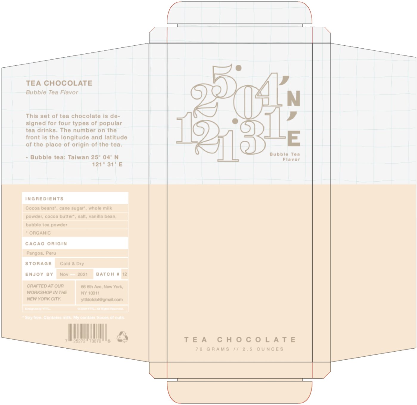
- Snap closure: convenient to store when the bar is divided into portions.
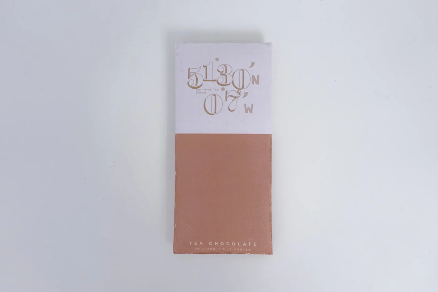
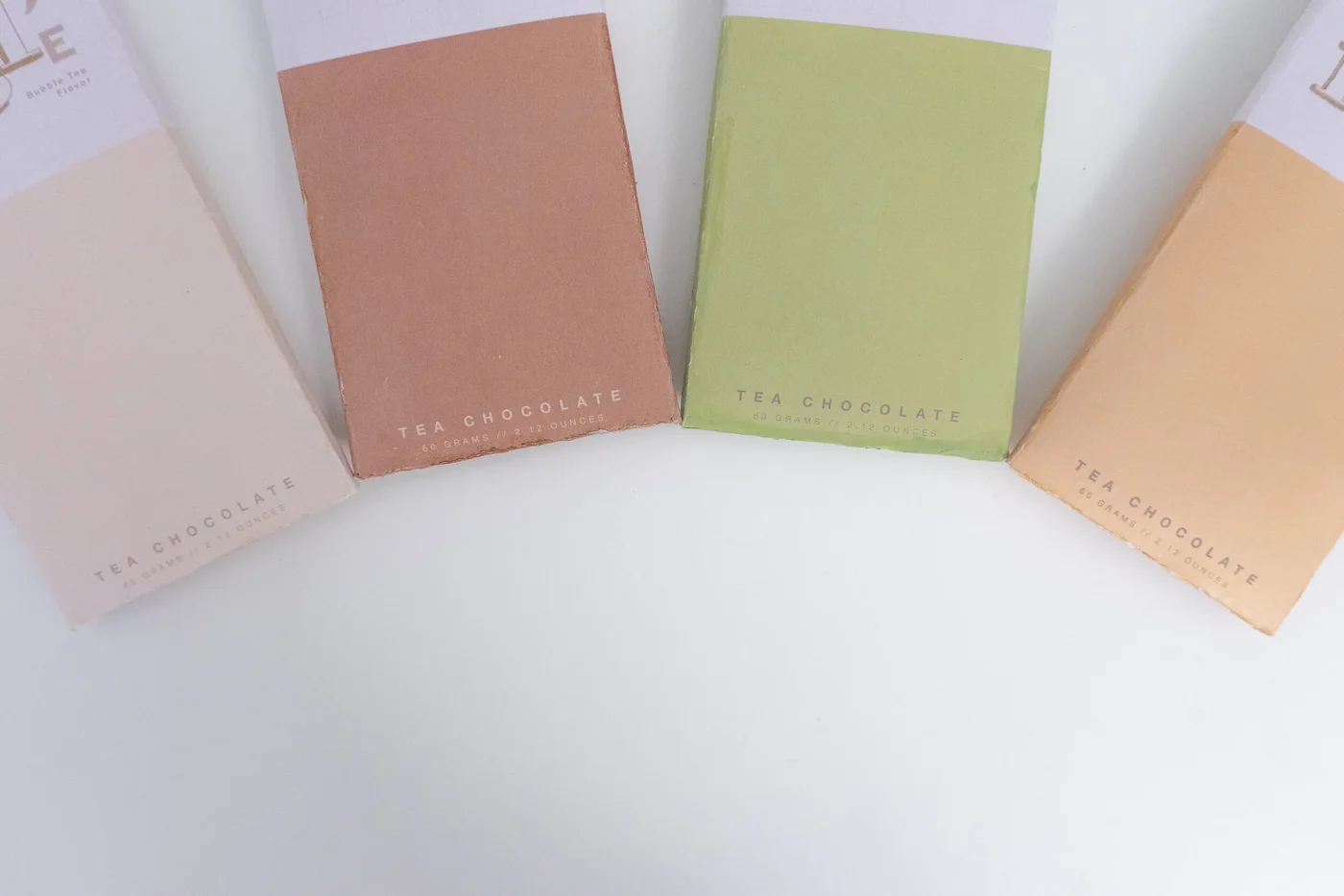
- Double-sided printing: the middle and lower portions of the front and back carry the flavor-specific color.
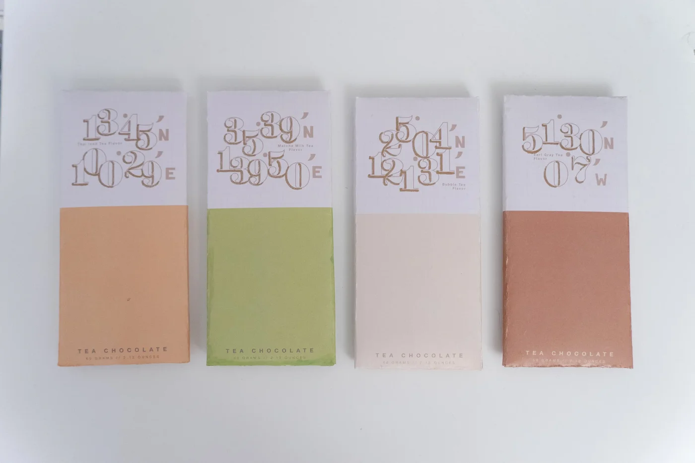
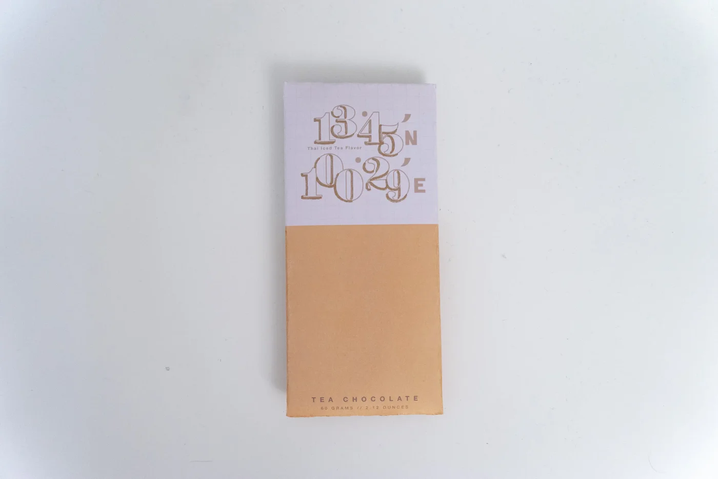
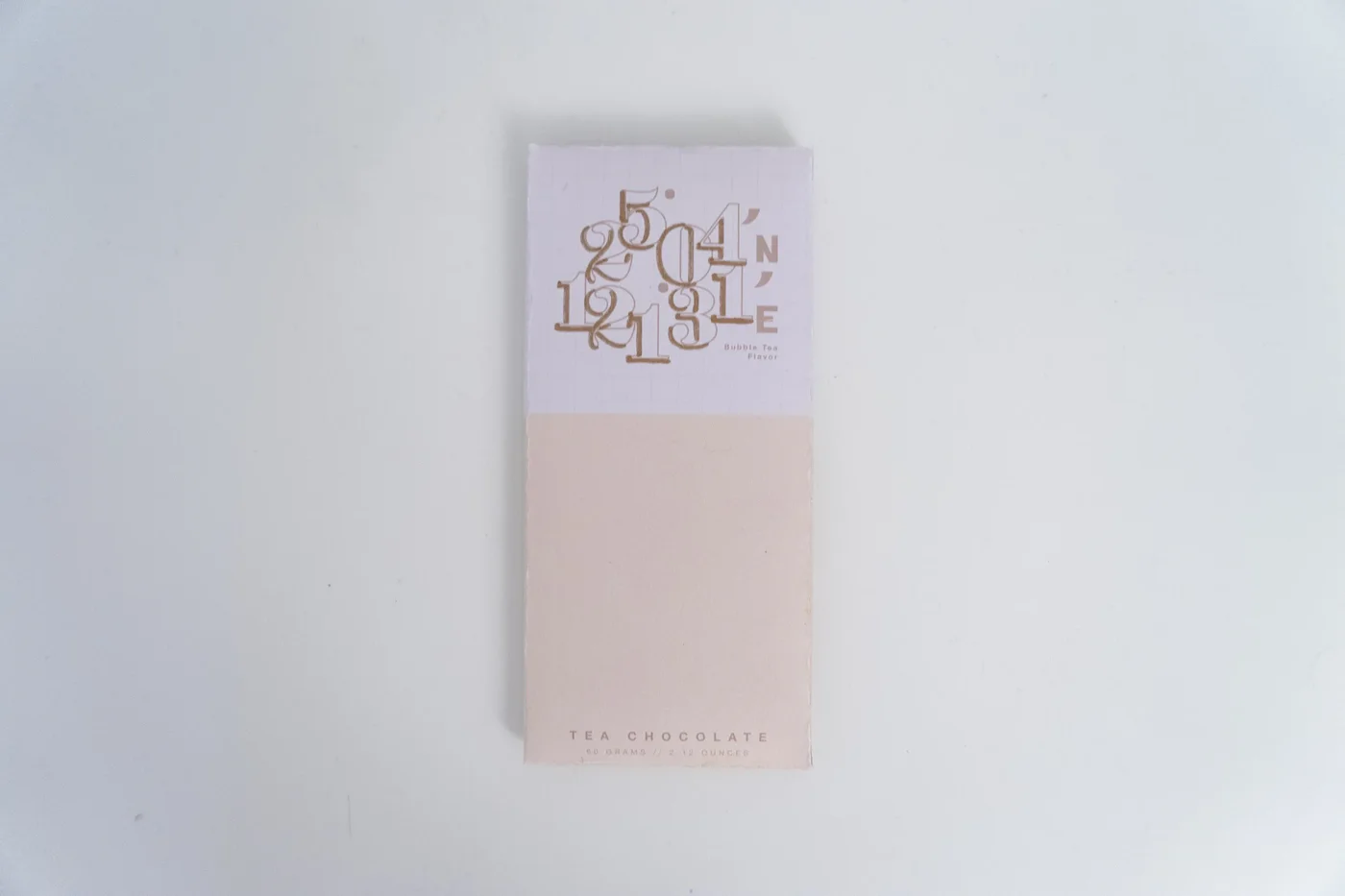
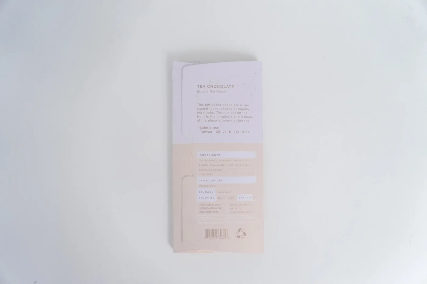
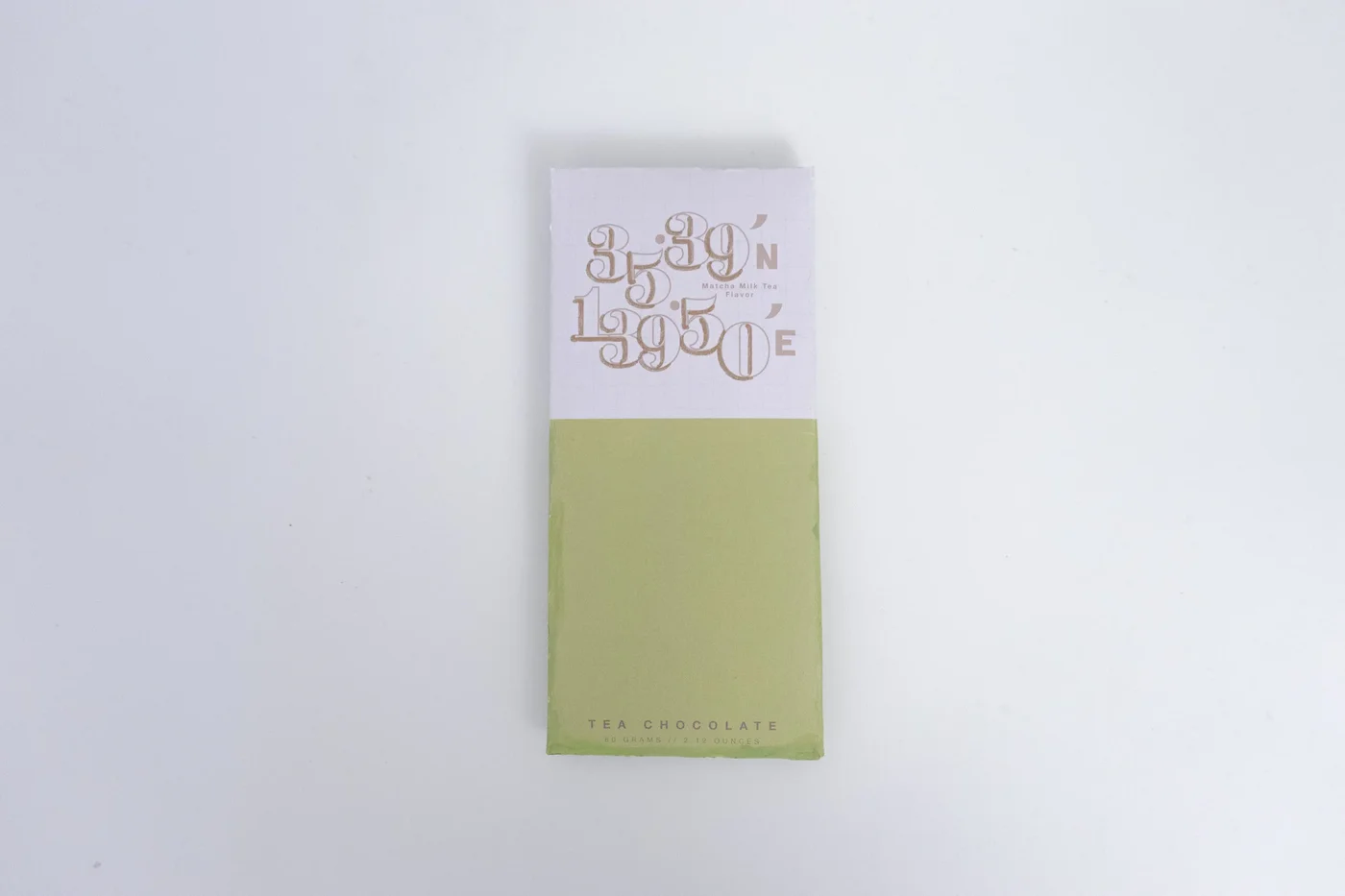
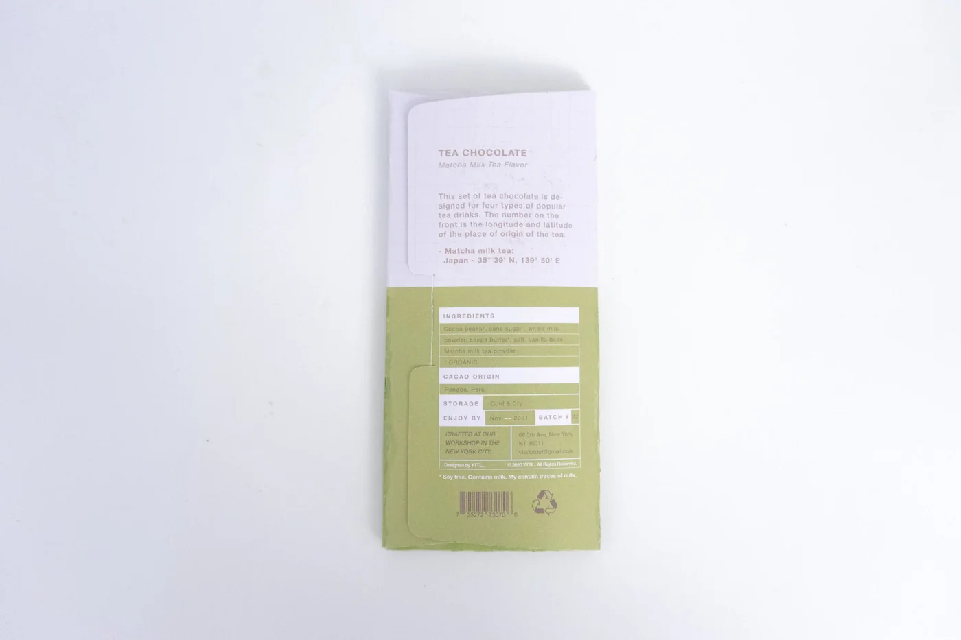
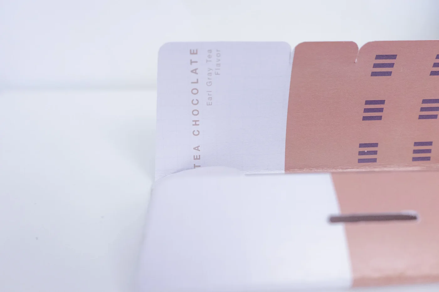
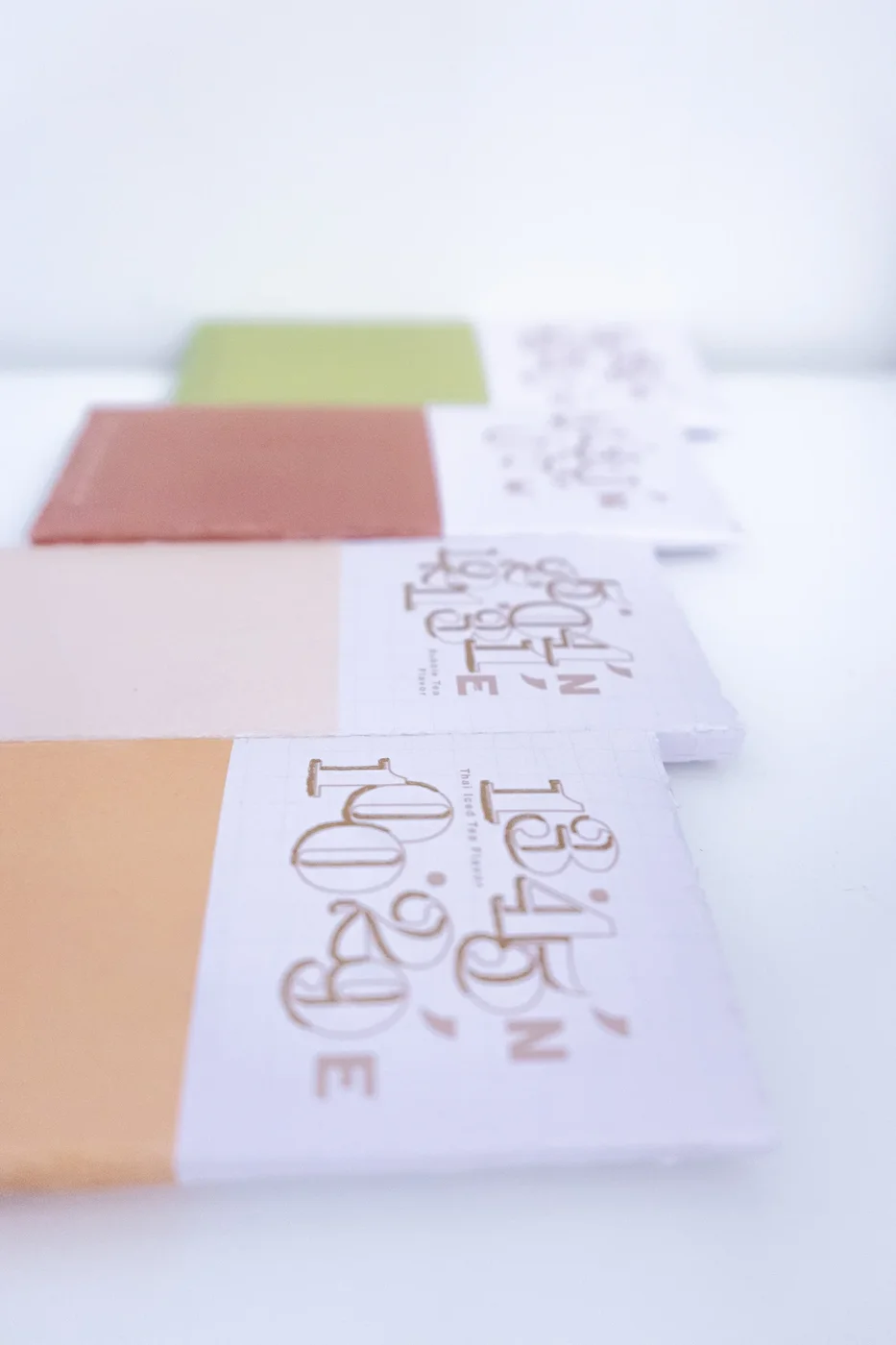
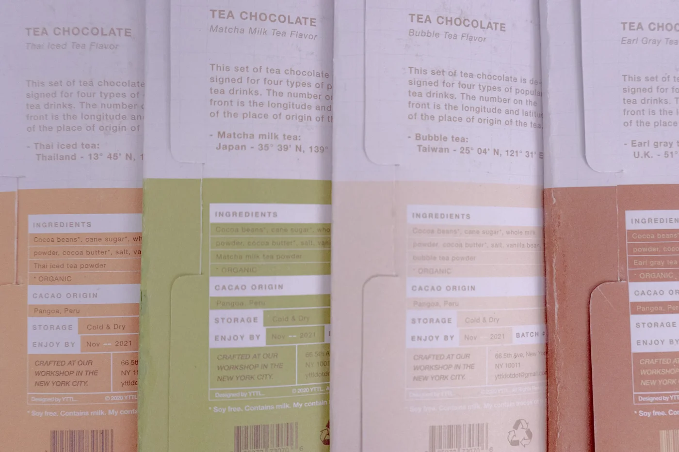
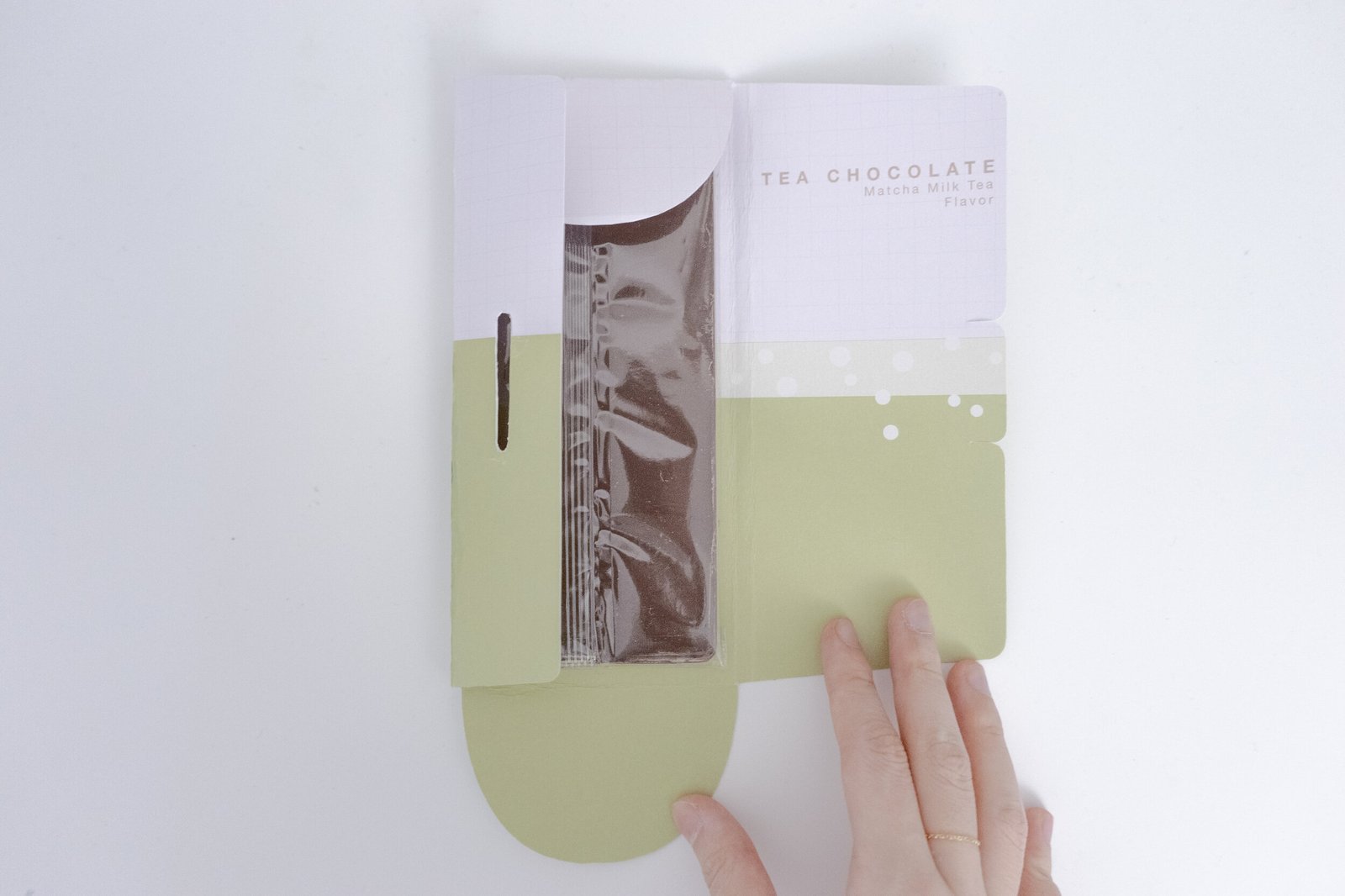
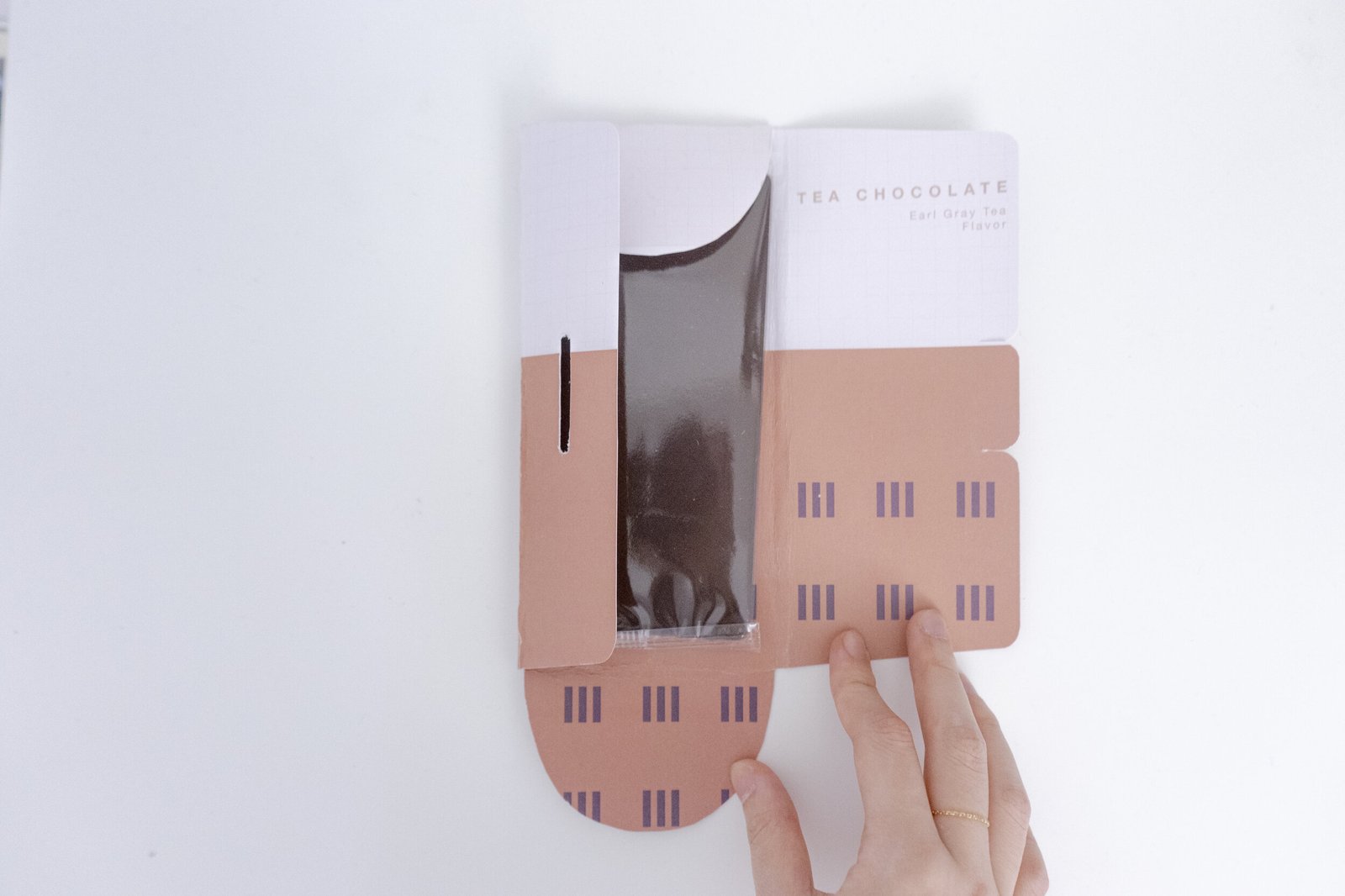
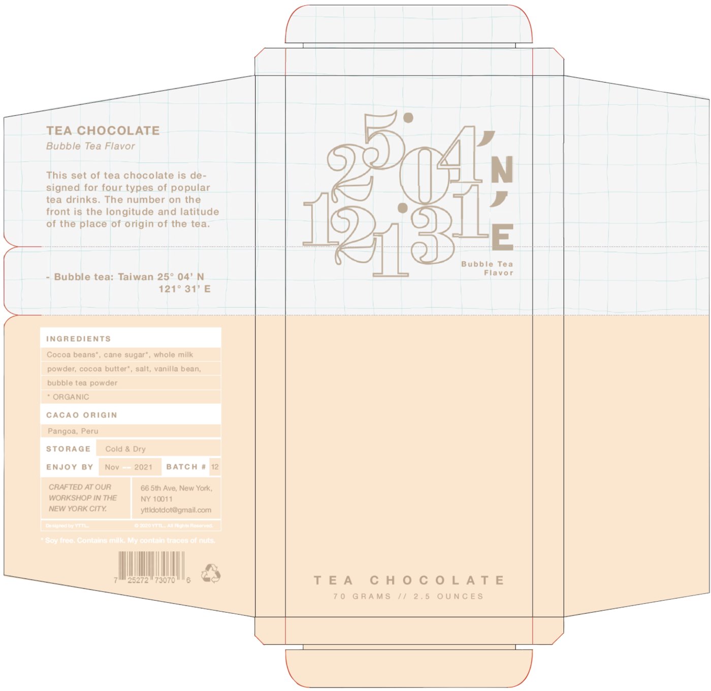
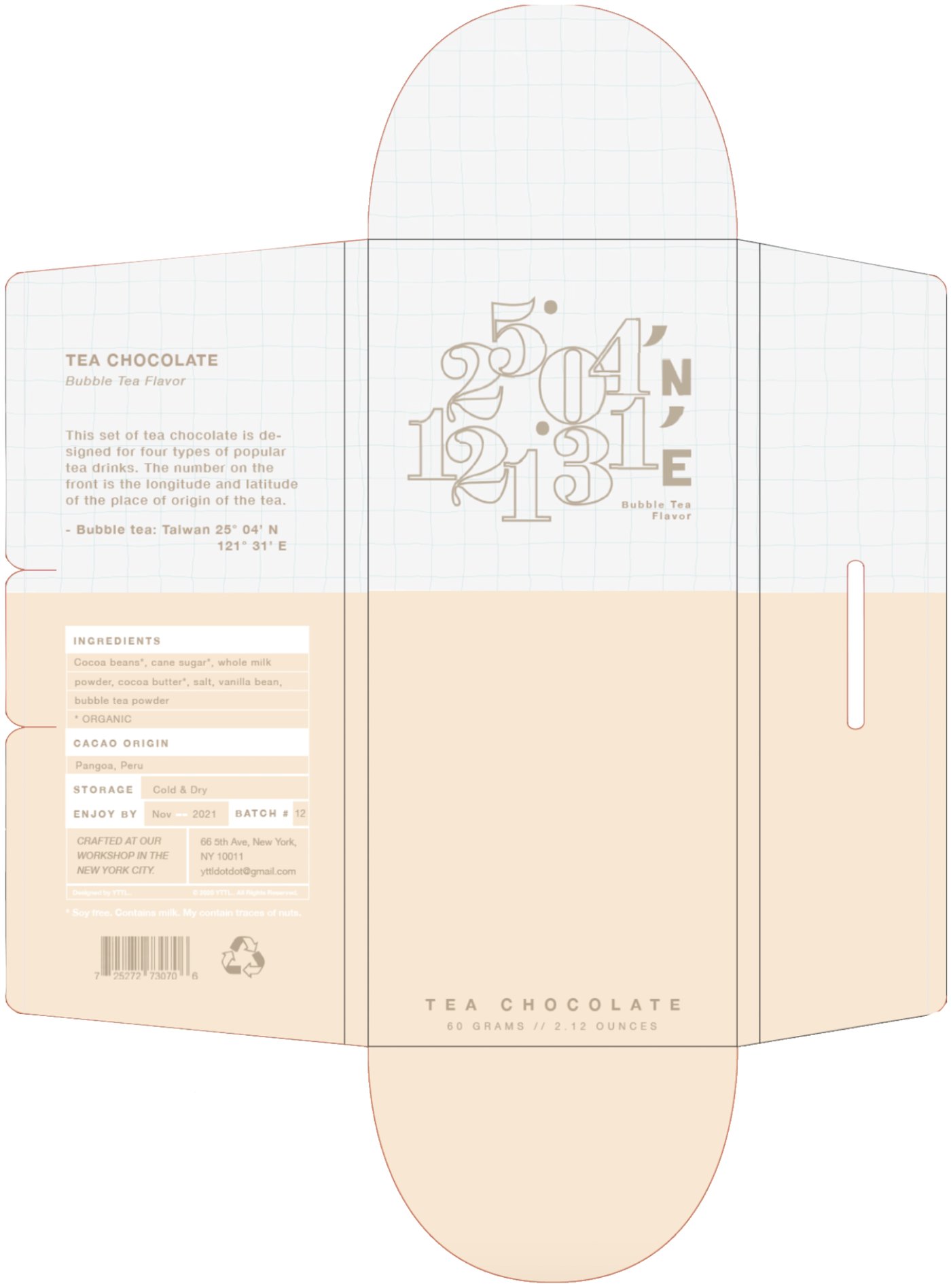
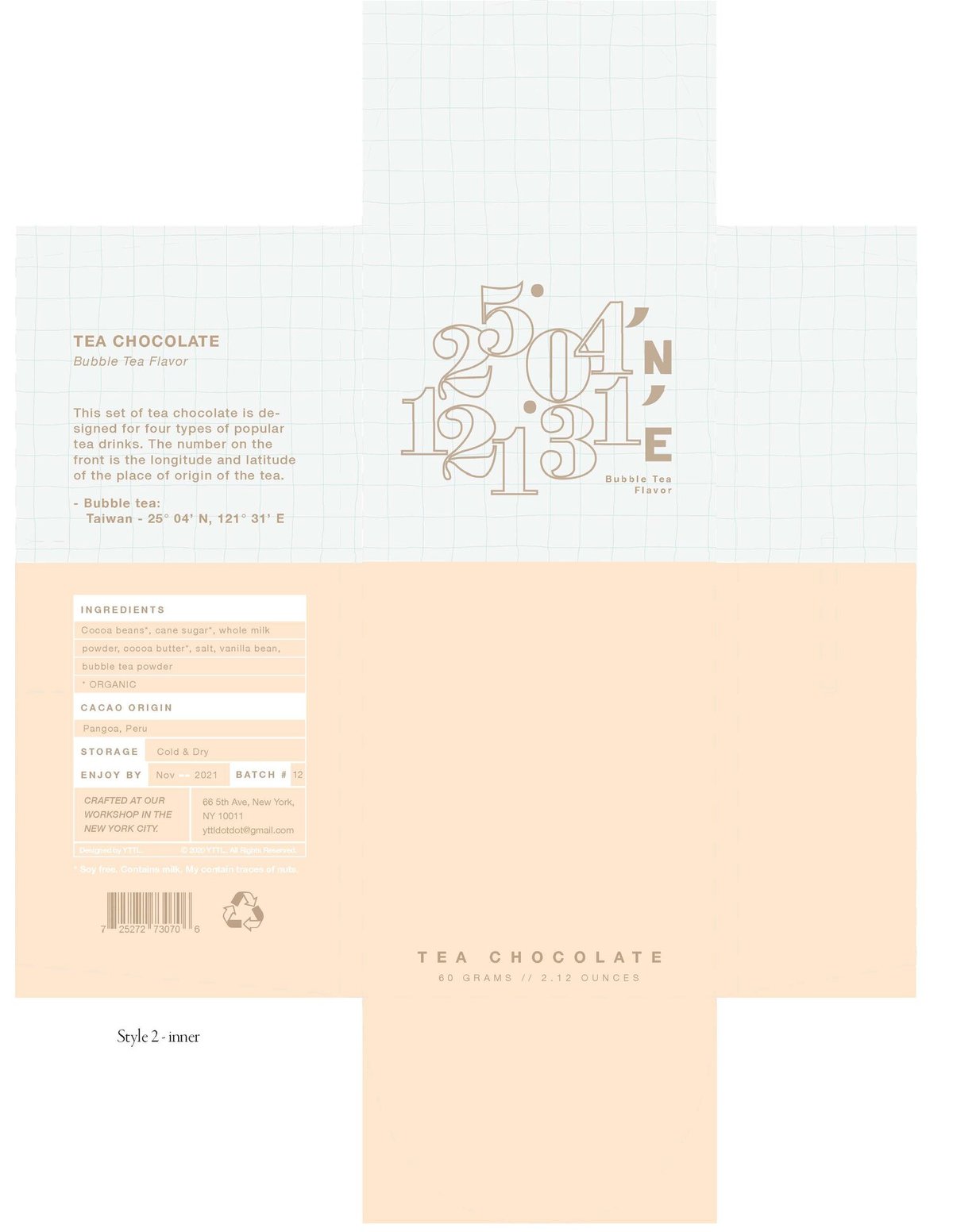
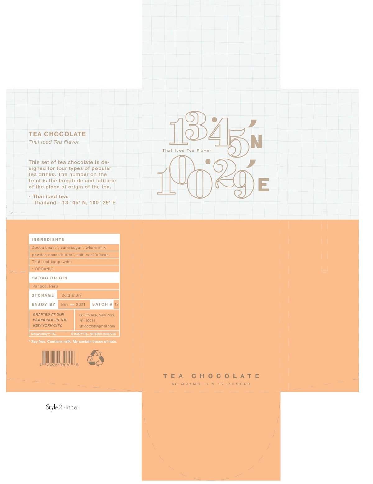
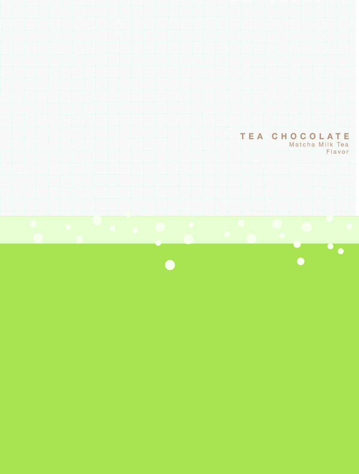
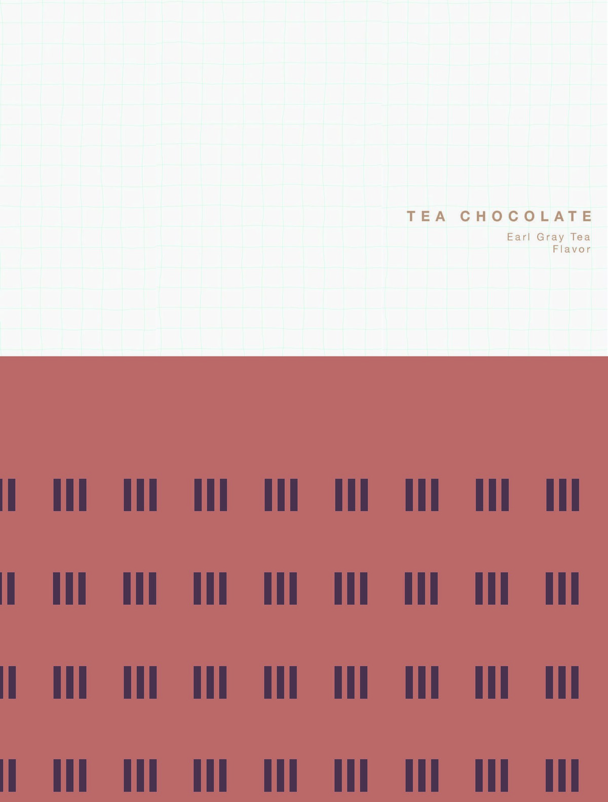
- Latitude & longitude graphics: the digital pattern on the front of each package marks the coordinates of that tea's place of origin — every flavor is distinguished by where it was born.
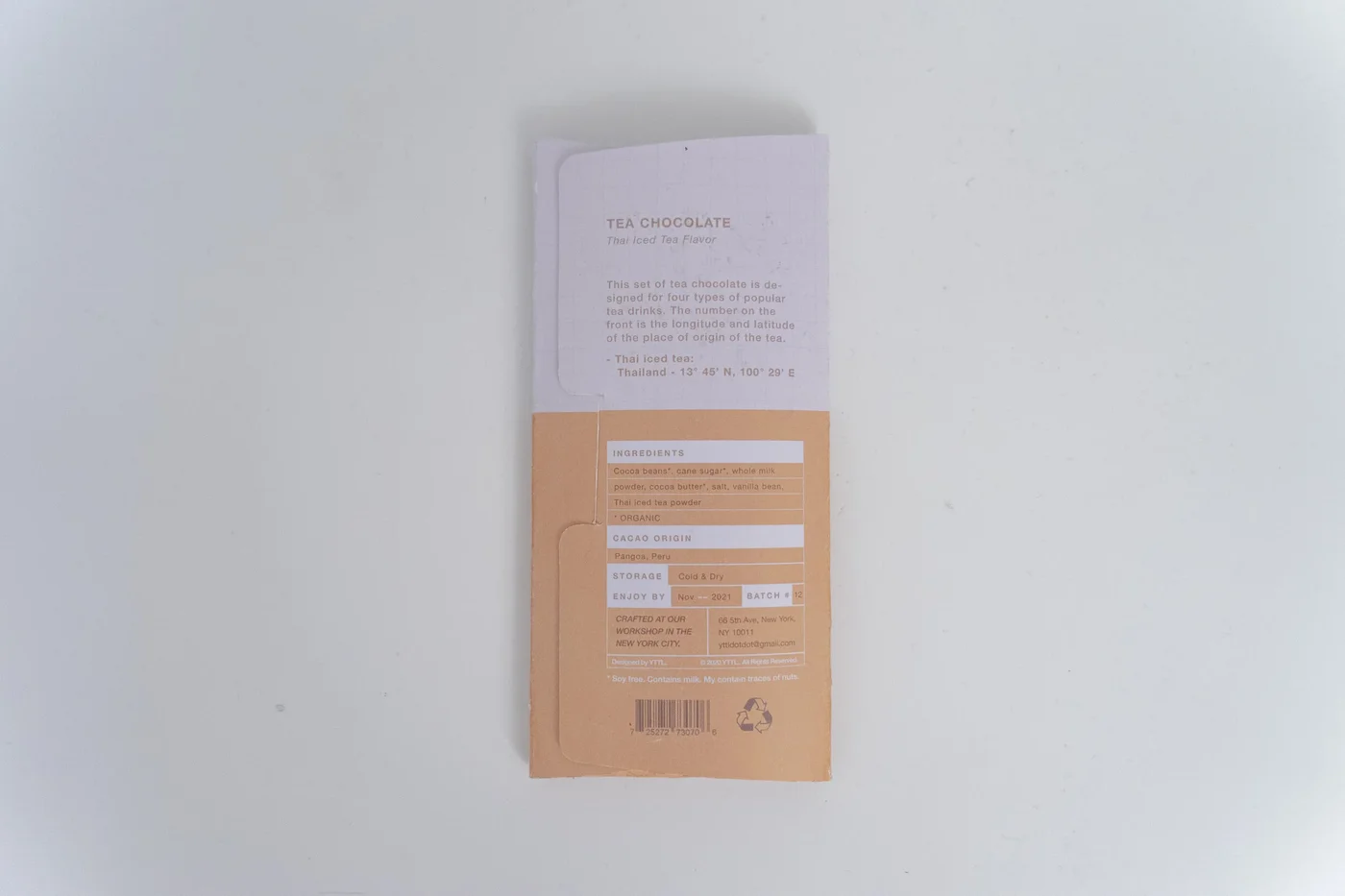
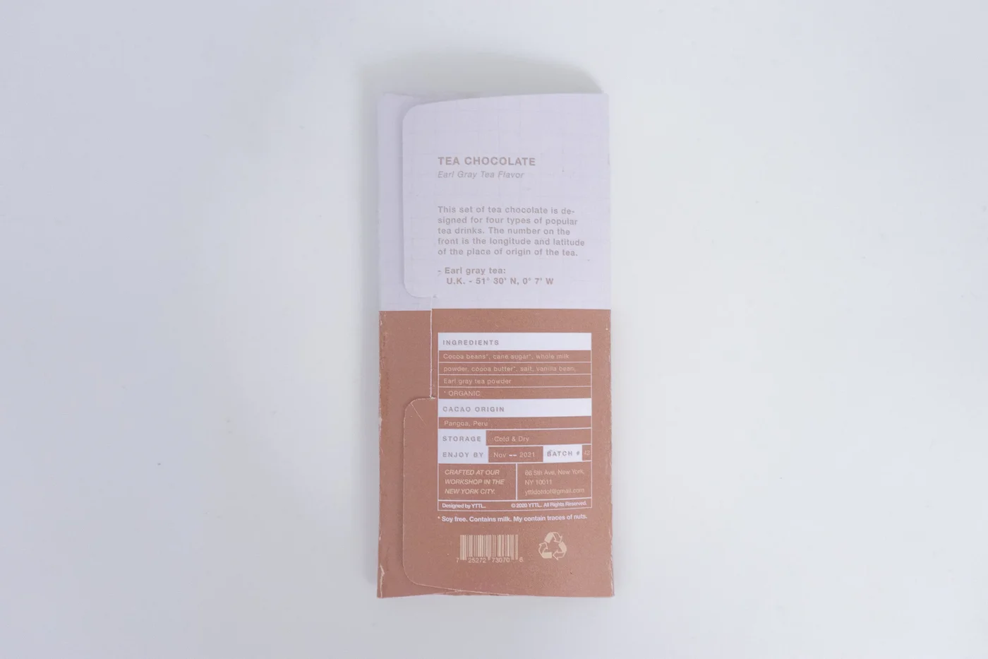
- Origin story on the back: the rear panel tells the brief story of each tea drink and lists its ingredients.
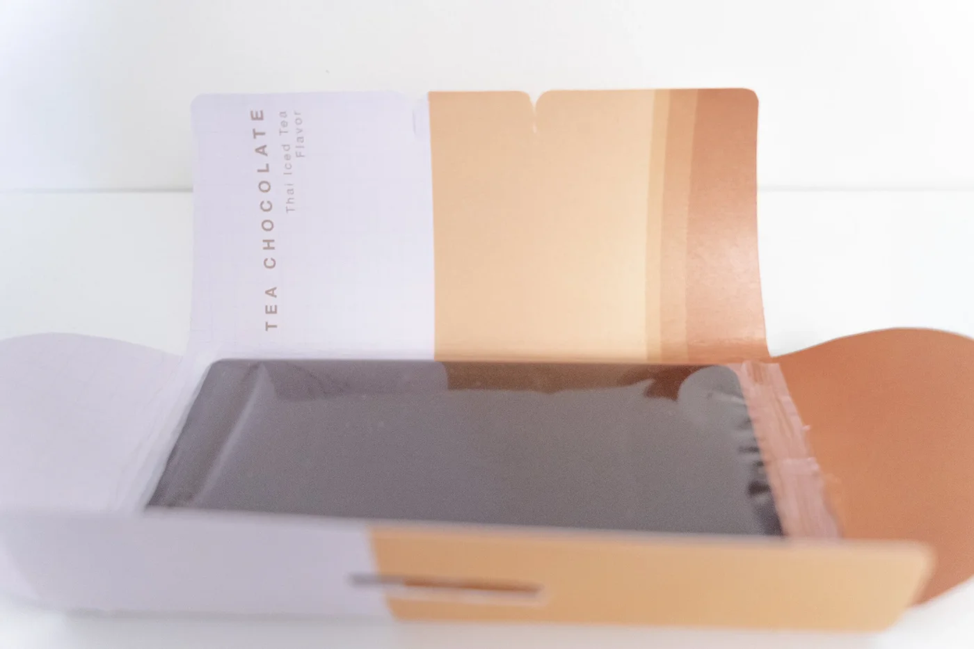
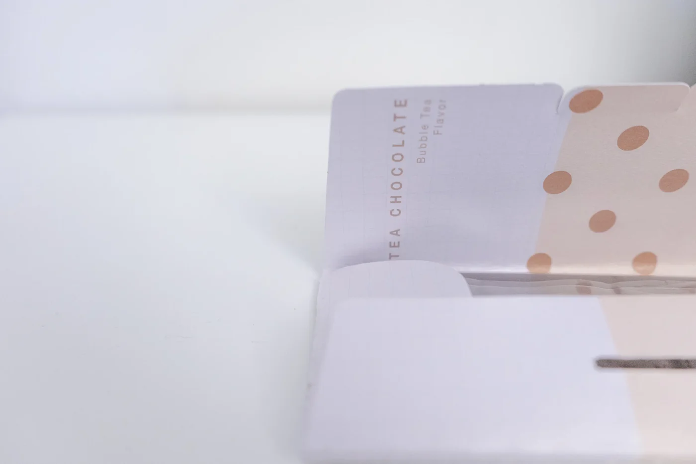
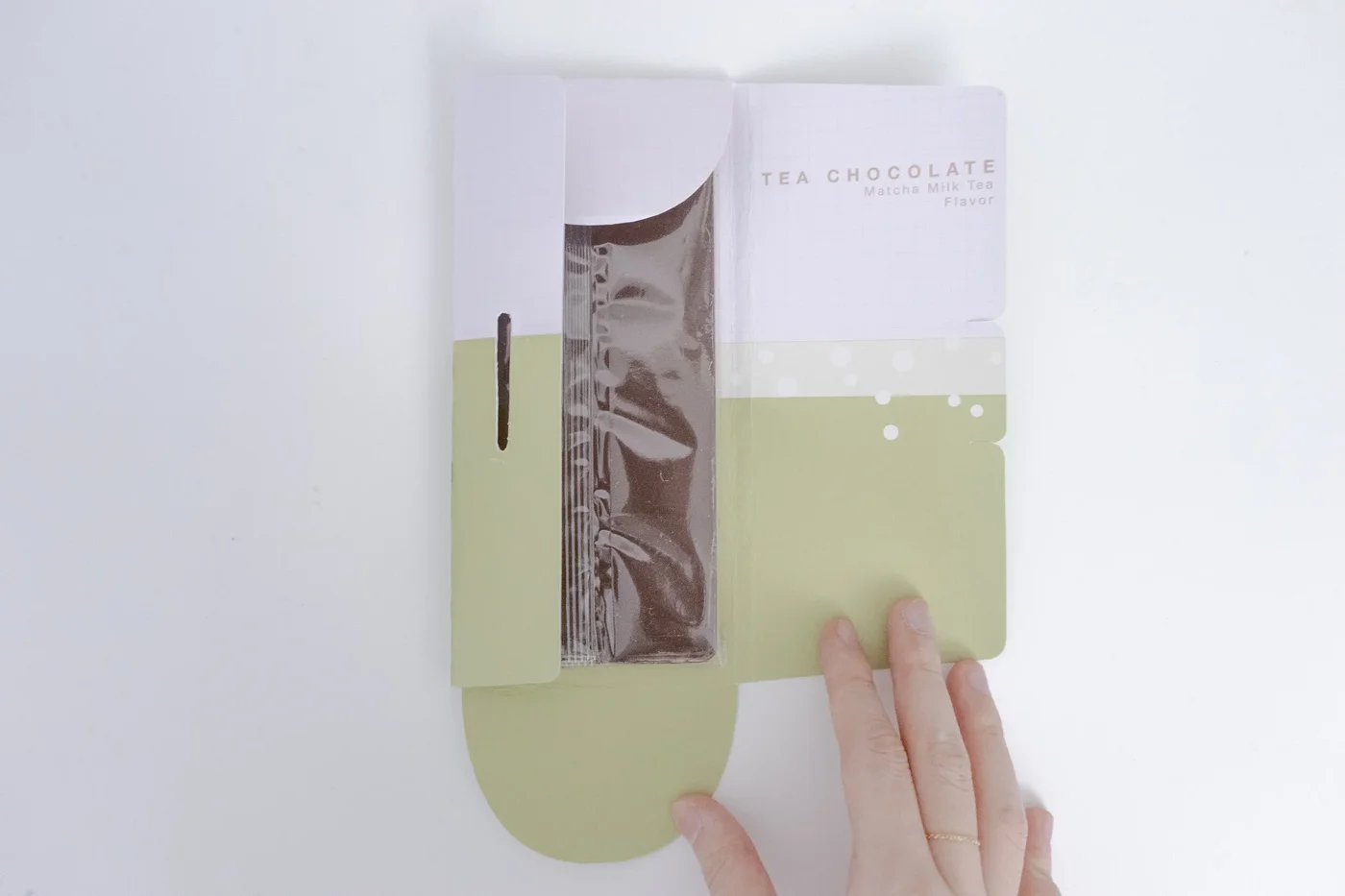
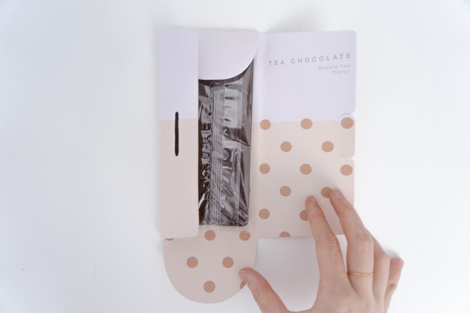
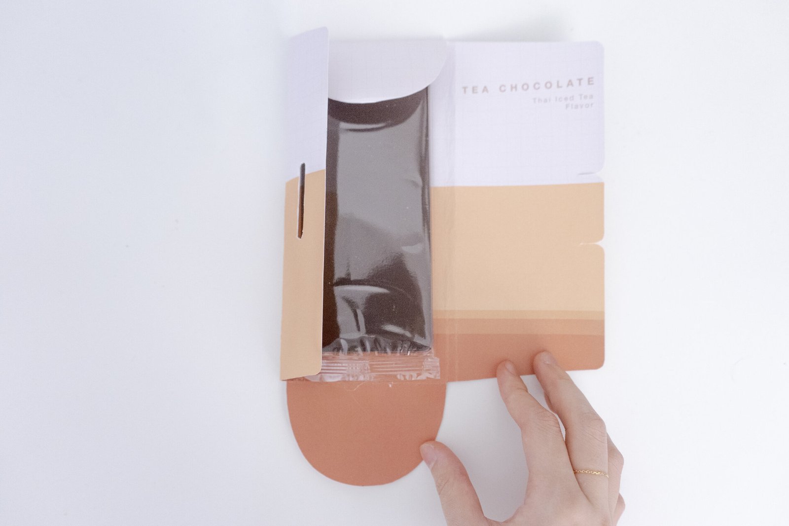
- Inside illustration: opening the package reveals a geometric illustration of the corresponding tea drink.
Process
Four passes: user research on flavors, packaging-form exploration, color & type system, and material selection.
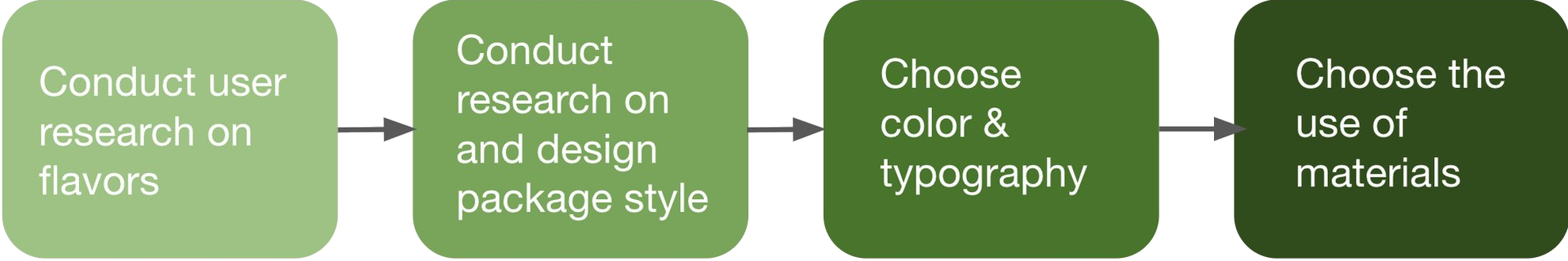
1 · User research on flavors
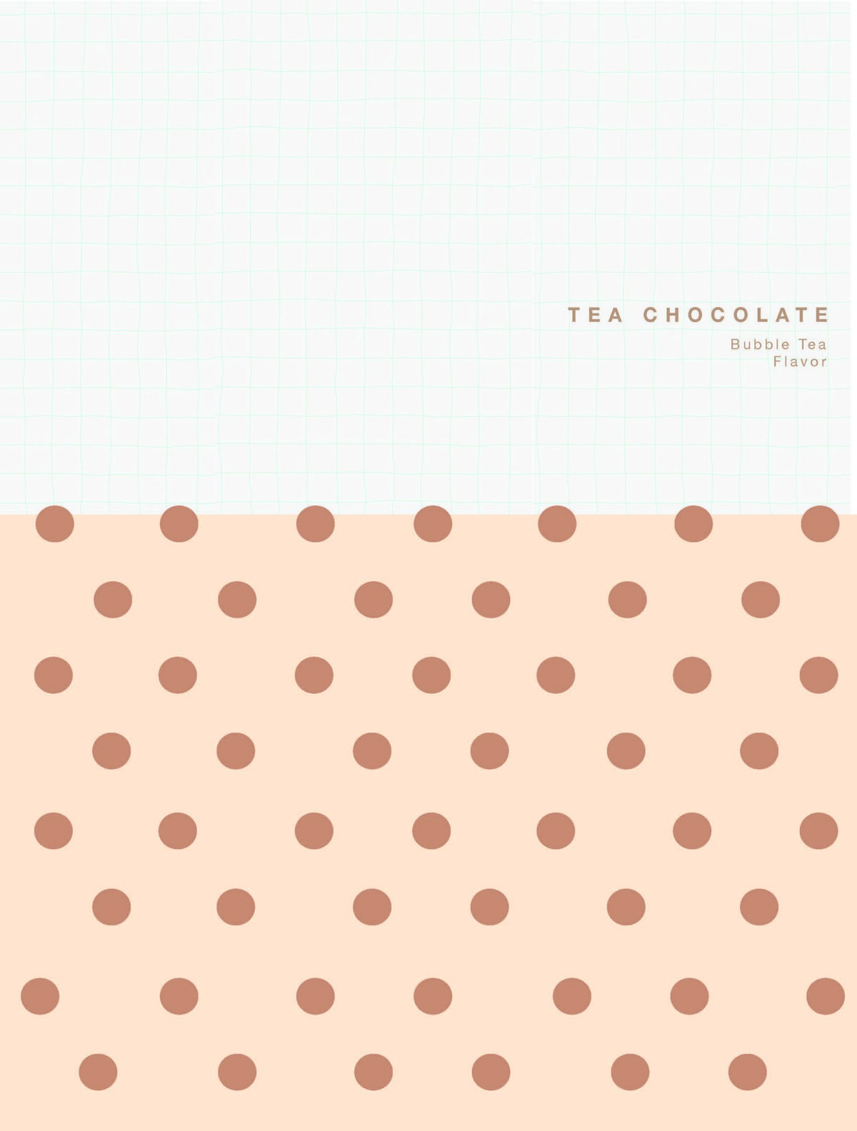
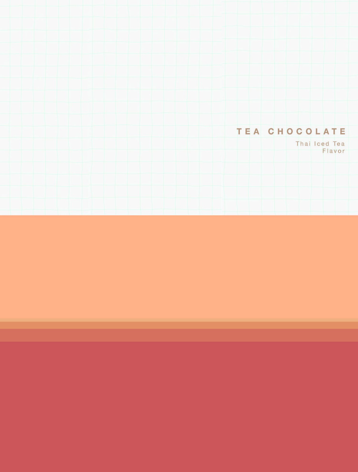
I chose tea as the chocolate theme because of the rise of milk tea in European and American markets, which has captured huge attention among young people. To validate the four flavors, I surveyed 45 people aged 16 – 26 about their favorite tea drinks. The results: 35% bubble tea, 21% matcha, 18% Thai milk tea, 14% Earl Grey — which became my four flavor SKUs.
2 · Packaging-form exploration
I prototyped three packaging methods and reviewed pros & cons with classmates and instructors:
- Standard top-open closure (left). Familiar to most buyers and convenient for repeated storage. Downside: it appears widely on the market and feels generic.
- Open-side closure (middle). Convenient storage, and the inside surface can carry illustrations. Slightly more complex to open and close than option #1.
- Tear-strip opening (right). The center of the package tears apart, and the bottom forms a cup shape revealing a "cup of tea" illustration when opened. The concept is novel, but it cannot be resealed and is overly complicated for daily use.
After several rounds of testing and discussion, we agreed that option #2 (open-side closure) was the best fit for the brand theme.
3 · Color & typography
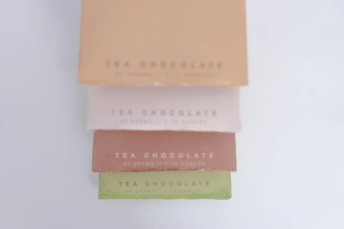
Each flavor gets a dedicated color palette and geometric pattern keyed to the tea drink's visual identity:
- Bubble tea: light warm-tone base with brown circles evenly distributed across the surface, suggesting tapioca pearls.
- Thai milk tea: orange base with a gradient toward the bottom, suggesting tea sediment.
- Matcha: a thin layer of light green on top with irregular white circles, suggesting the bubble crown of whisked matcha.
- Earl Grey: kermesinus (deep crimson) base with mulberry-colored stripes, suggesting Earl Grey tea leaves.
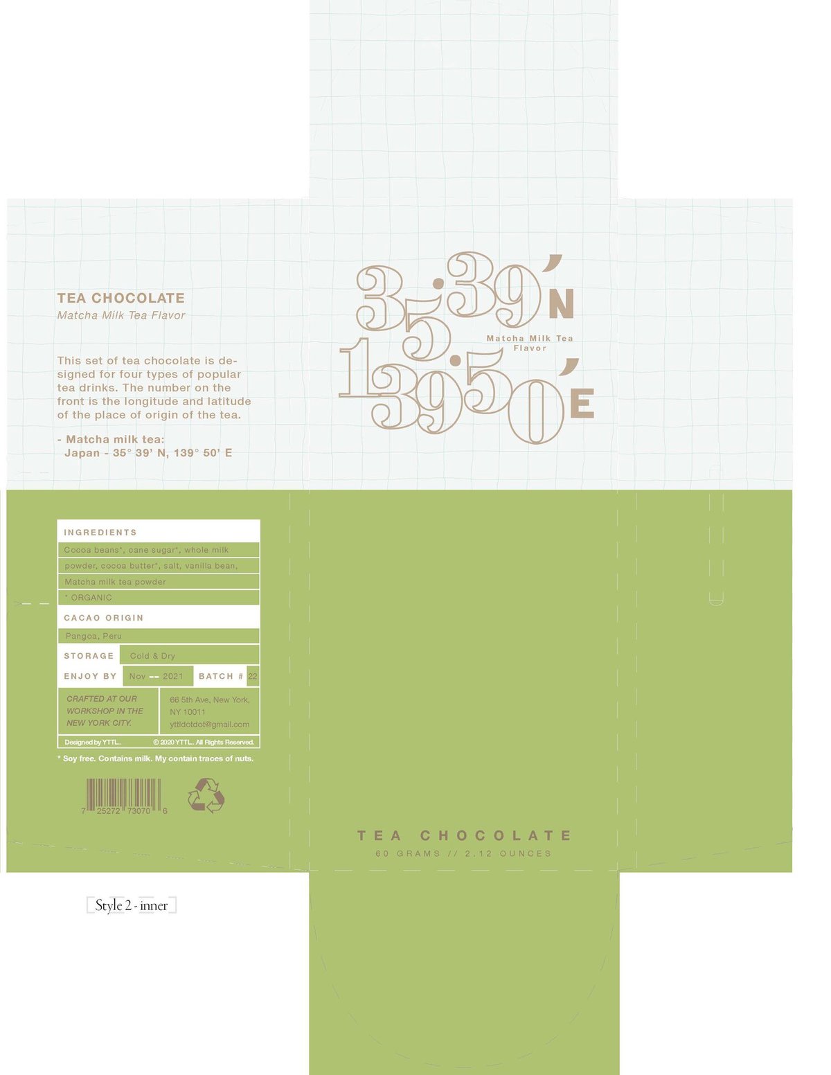
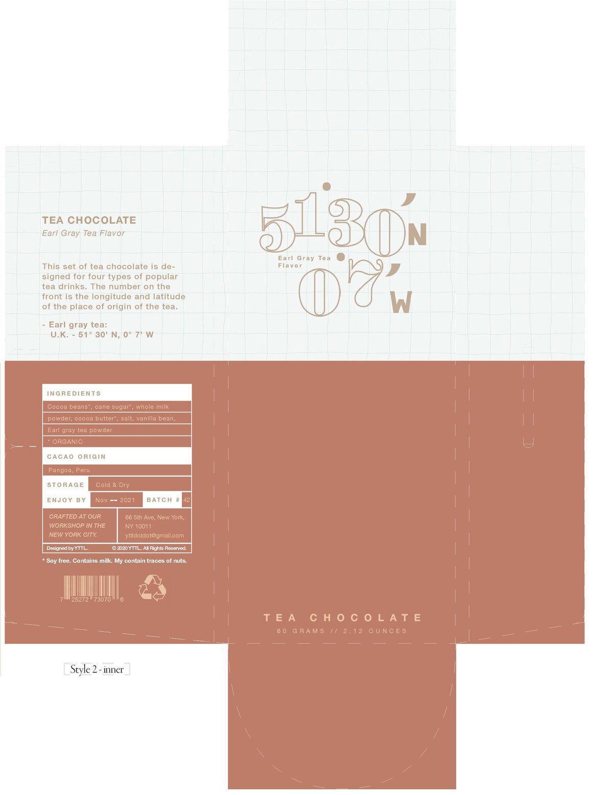
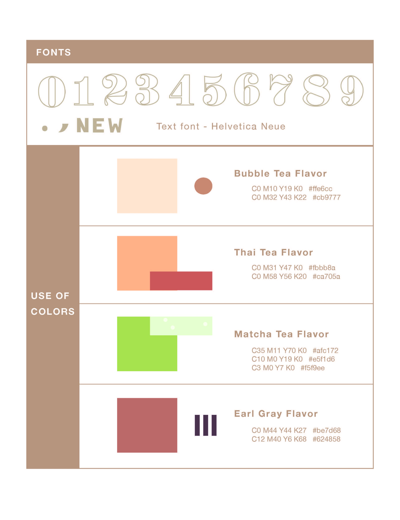
I documented the full color & type system as a usage table — color parameters per flavor, geometric figures and their style rules, and a custom numerical / punctuation set designed specifically for the latitude & longitude coordinates on the front panel.
4 · Materials
Based on the target price point, I specified 350g white pearl card stock — durable enough for shelf life, with a glossy finish that lets the illustrations shine. The front title uses embossed texture to add tactile emphasis.
Gallery
Click any image to zoom in and see the print, embossing, and pattern details.