Branding · Packaging · 2019
Honey Fragrance — FLOWEY
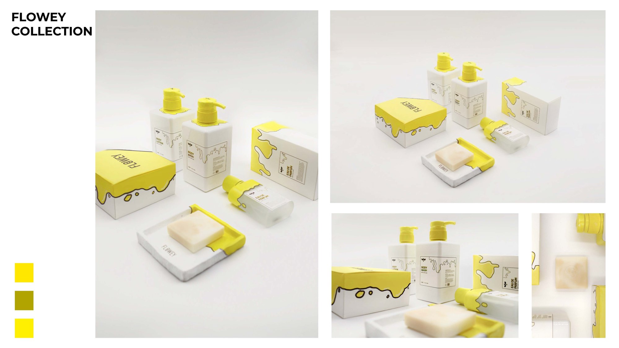
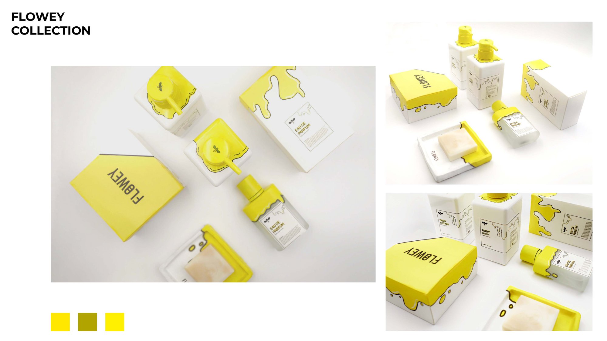
A honey-themed personal-care line — perfume, body wash, lotion, and soap — built around the idea that honey flows. The wordmark fuses "flower" with "flow," and the packaging carries that liquidity through every product in the family.

Section 01
Branding Characteristics
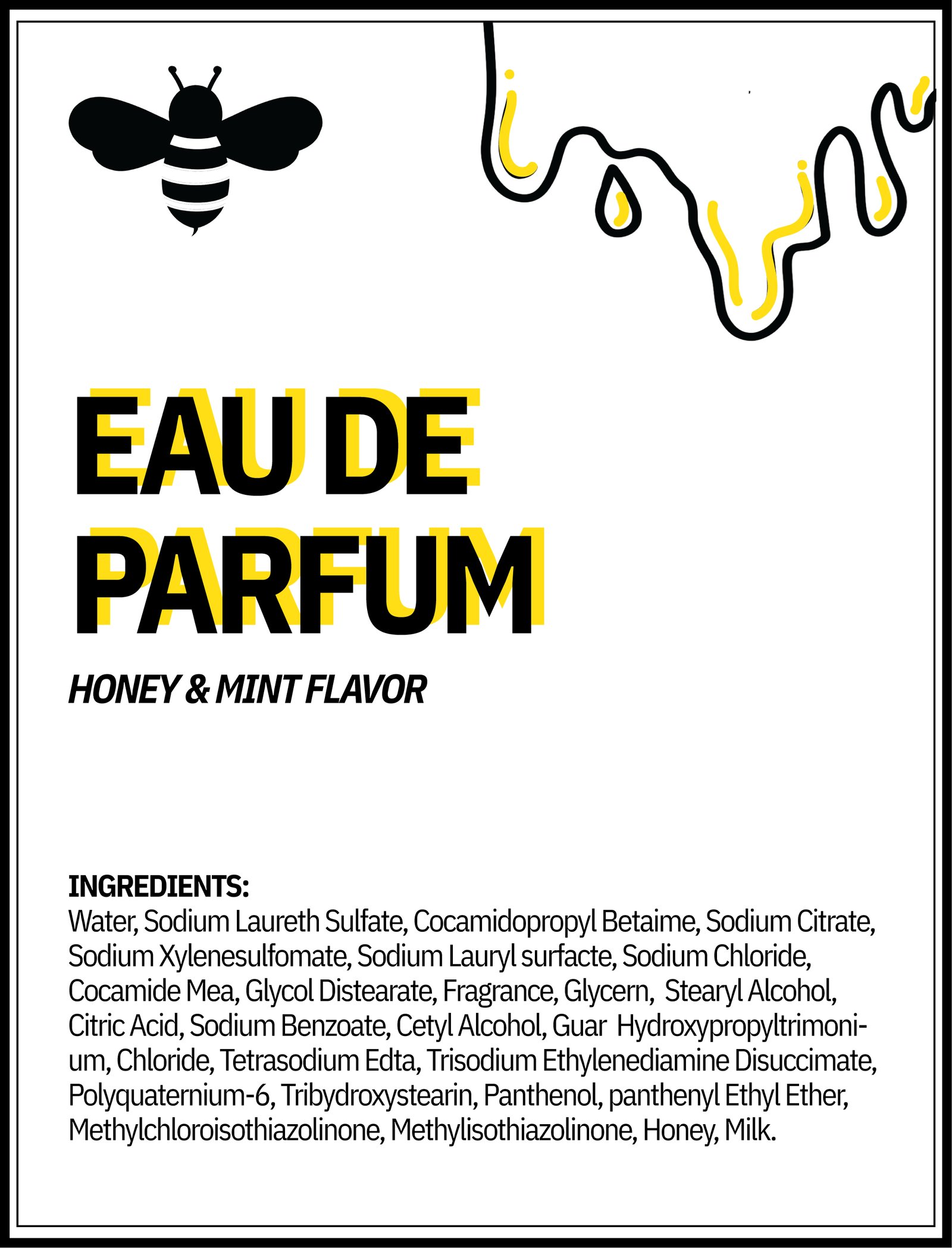
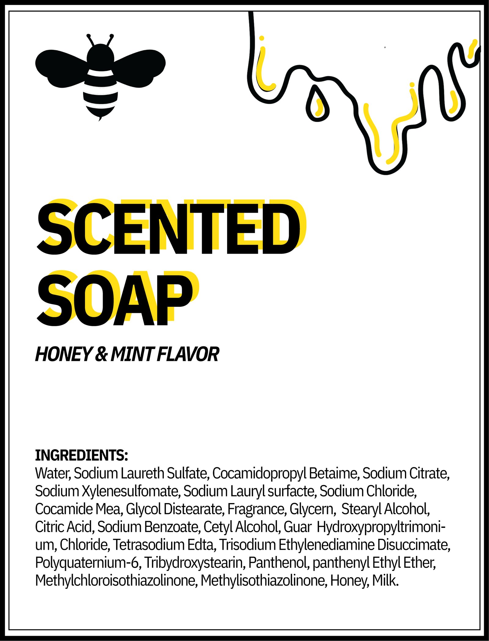
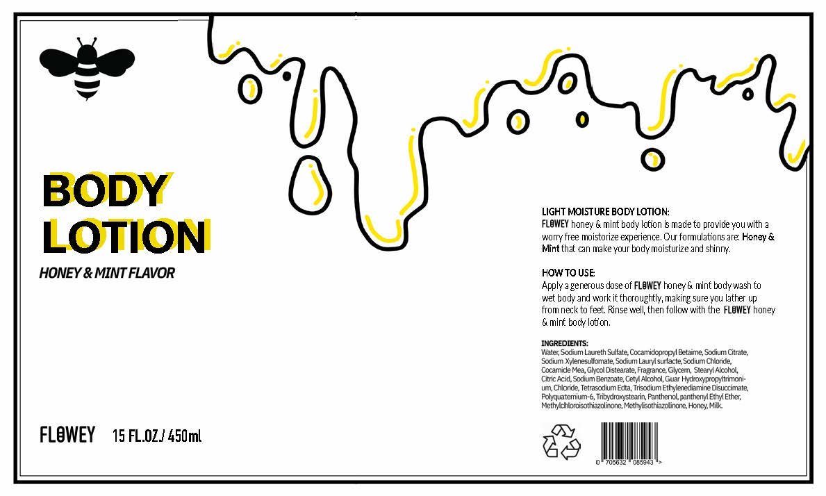
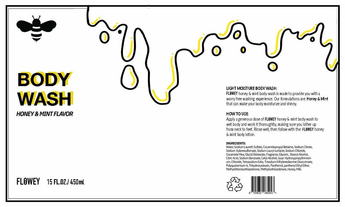
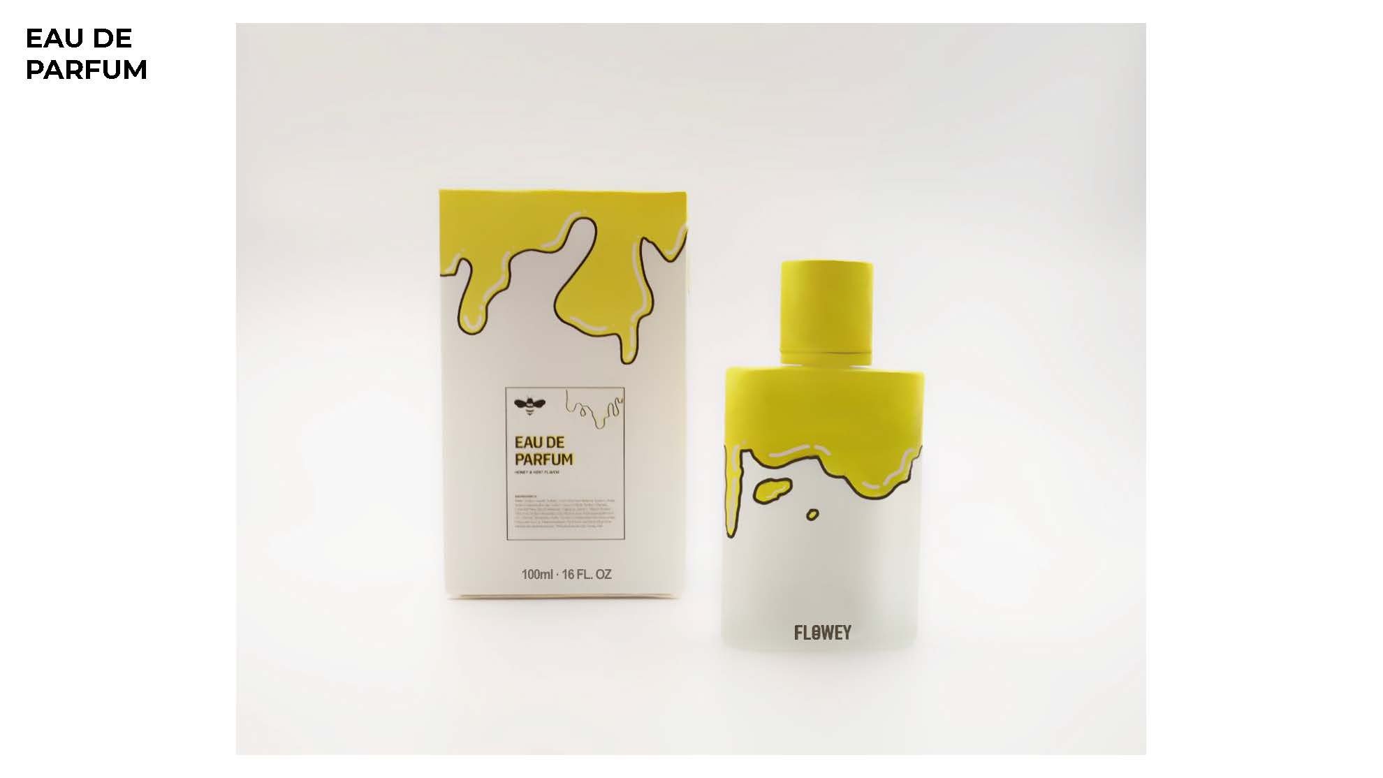
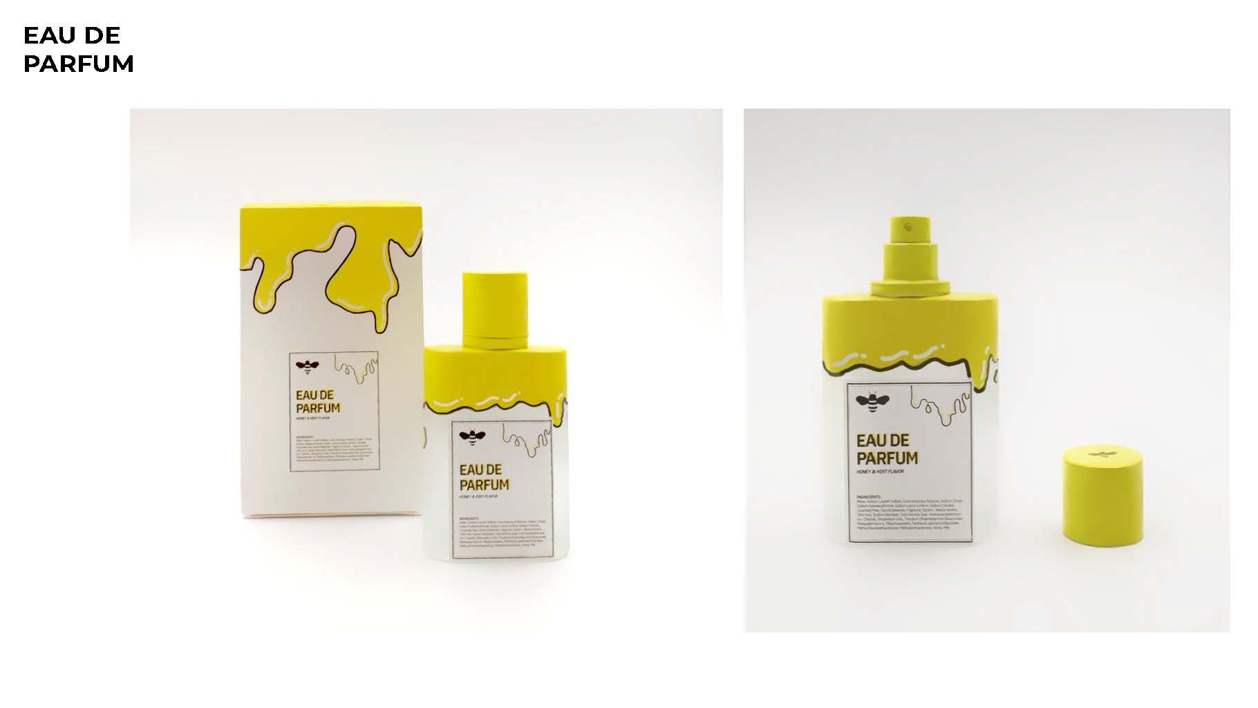
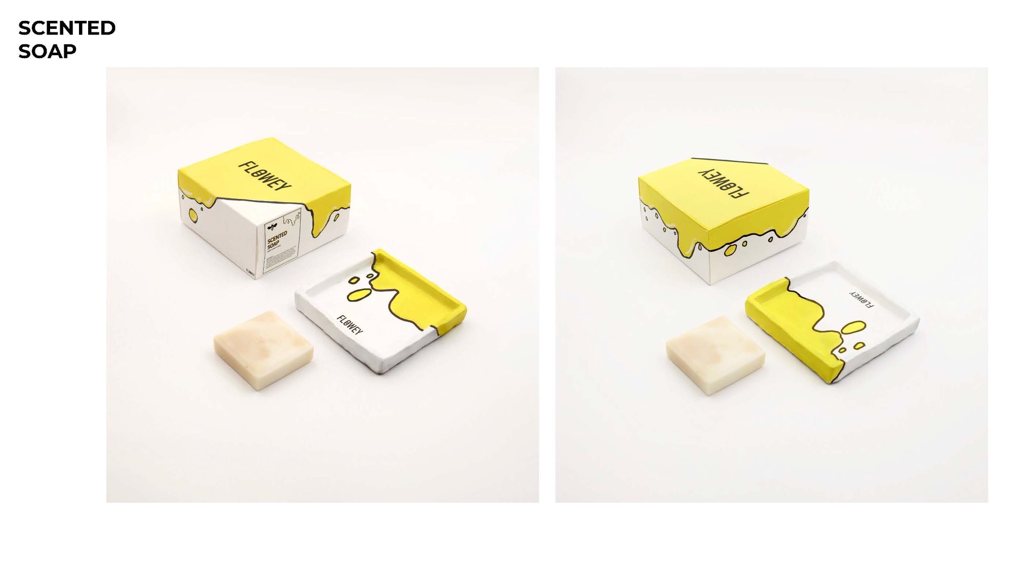
FLOWEY is a series of honey-based aromatherapy and personal-care products. The name is a portmanteau: "flower" (where honey comes from) + "flow" (the fluidity of honey itself). The "O" in the wordmark wears the iconic black stripes of a bee.
Fluidity also runs through the packaging language — every product shows honey in motion, dripping or pooling across the surface.
Section 02
Target
- Consumer age range: 16 – 26
- Target market: European and American
- Sales channel: mid-market supermarkets (e.g., Trader Joe's)
- Price range: USD $20 – $50 per product
Section 03
Highlights of the Design
Four design decisions that define the FLOWEY visual system.
- Youthful positioning: because the target audience skews young, the visual language uses vibrant yellow and comic-style black linework.
- Cost-conscious materials: body wash and lotion use plastic bottles; perfume uses minimal-craft glass bottles; the soap dispenser is also plastic — all chosen to fit the affordable target price.
- Per-product labels: each item has its own label showing the product name and ingredient list in the same comic-style treatment.
- Simple system: a flowing-honey illustration sits at the top of each container; the rest of the surface is given over to the product label.
Section 04
Final Delivery
The full FLOWEY line — slide through the gallery to see each product shot.


Next project